
Contouring
Suppose temperature sensors collect measurements across a city. Where are the hot spots? Do they relate to the coldest area? We draw contours to visualize how the data relate to each other across the region. Contours are lines of constant value drawn through fields of two- or three-dimensional data. Values higher than the contour are on one side, and lesser amounts are on the other. The data field doesn’t need to be horizontal, and it does need to be solely spatial data. Time of data collection may be one of the dimensions.
Fields of data yield patterns that tell stories to scientists, business people, doctors, artists, athletes, hikers, explorers, etc. Similar to drawing, contouring slows us down to study the spatial relationships in fields of data. Many automated tools contour data for us, but it is helpful to understand how to contour data so we can better interpret the stories we find based on the observed patterns.
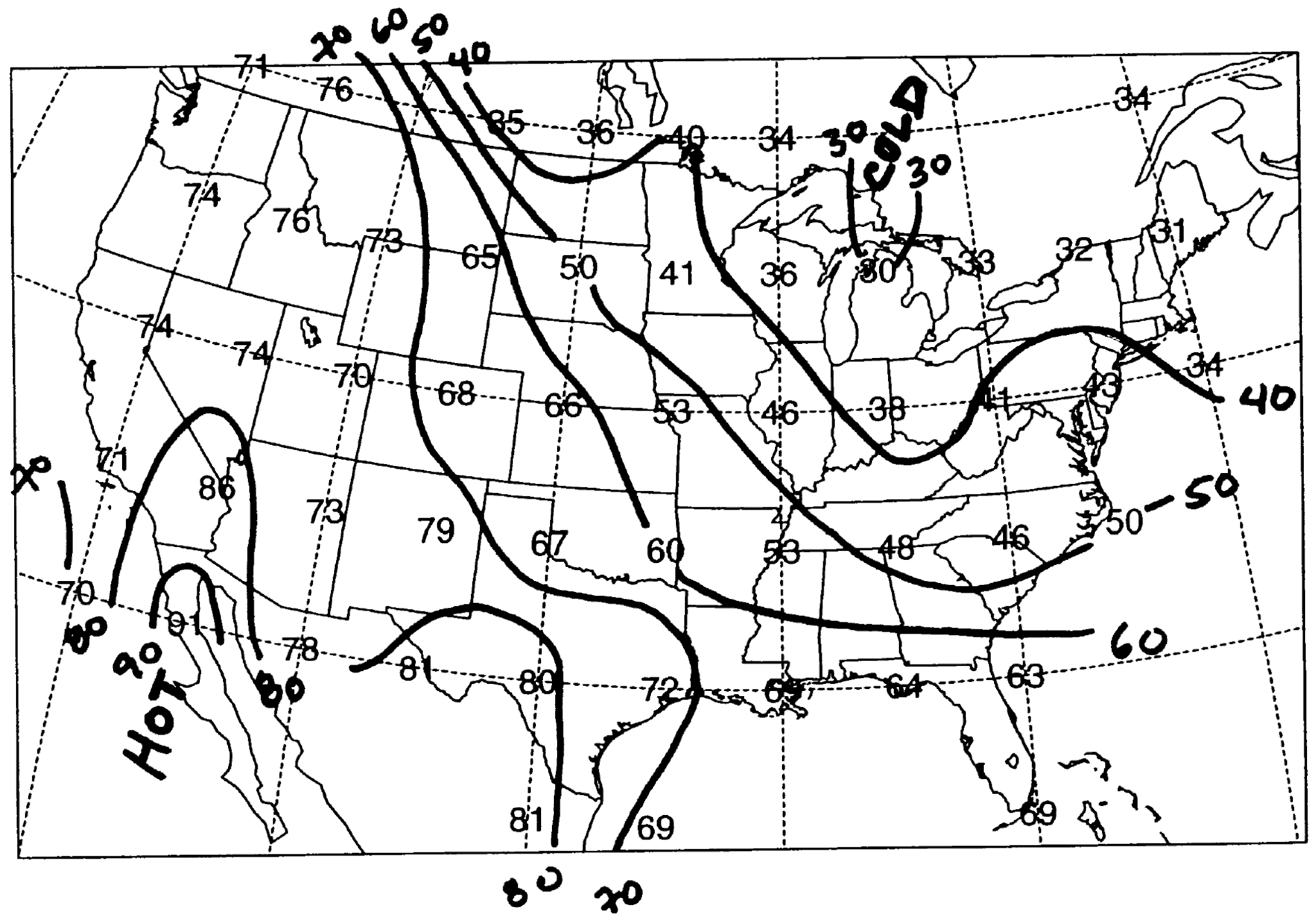
A contour map of surface air temperatures across the United States.
Drawing a Contour Map
We are going to draw temperature contours or isotherms (lines of constant temperature) for a vertical cross-section between the Mediterranean Sea and the Atlantic Ocean which is located at the Straits of Gibraltar. Download the data below.
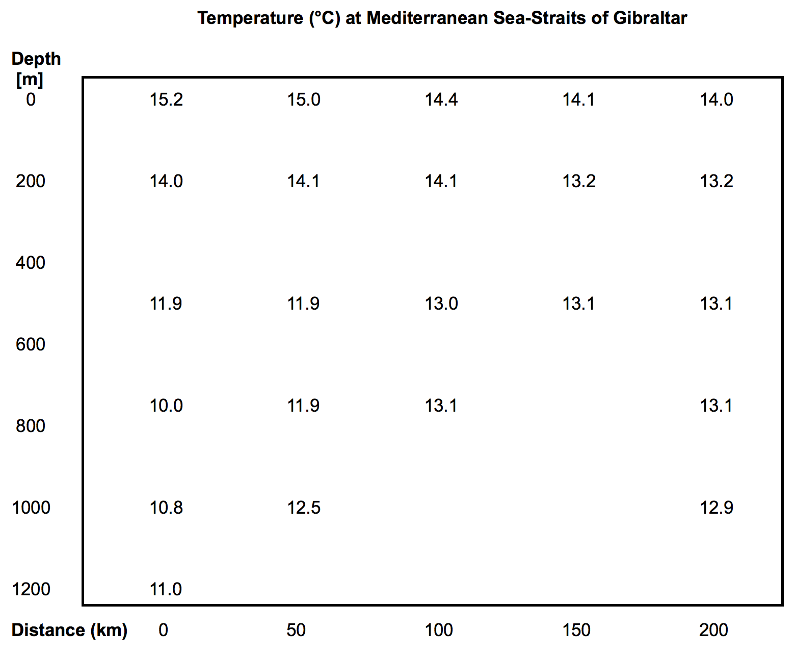
Water temperature across the Straits of Gibraltar extending from the surface to 1.2 km deep.
Step 1: Study the Data
Familiarize yourself with the data. At the top are surface temperatures. At the bottom are temperatures 1.2 km below the surface.
Data on the left are near the edge of the European side of the Mediterranean Sea, and data on the right are near Africa. Data are missing with depth, most likely due to an irregular seafloor bottom.
Step 2: Find the Range of Values
Find the maximum and minimum temperatures. In this case, the warmest temperature is 15.2°C and the coldest 10.0°C, which is a range of 5.2°C. Use the range of temperature to pick a contour interval of 1°C (the temperature between each contour).
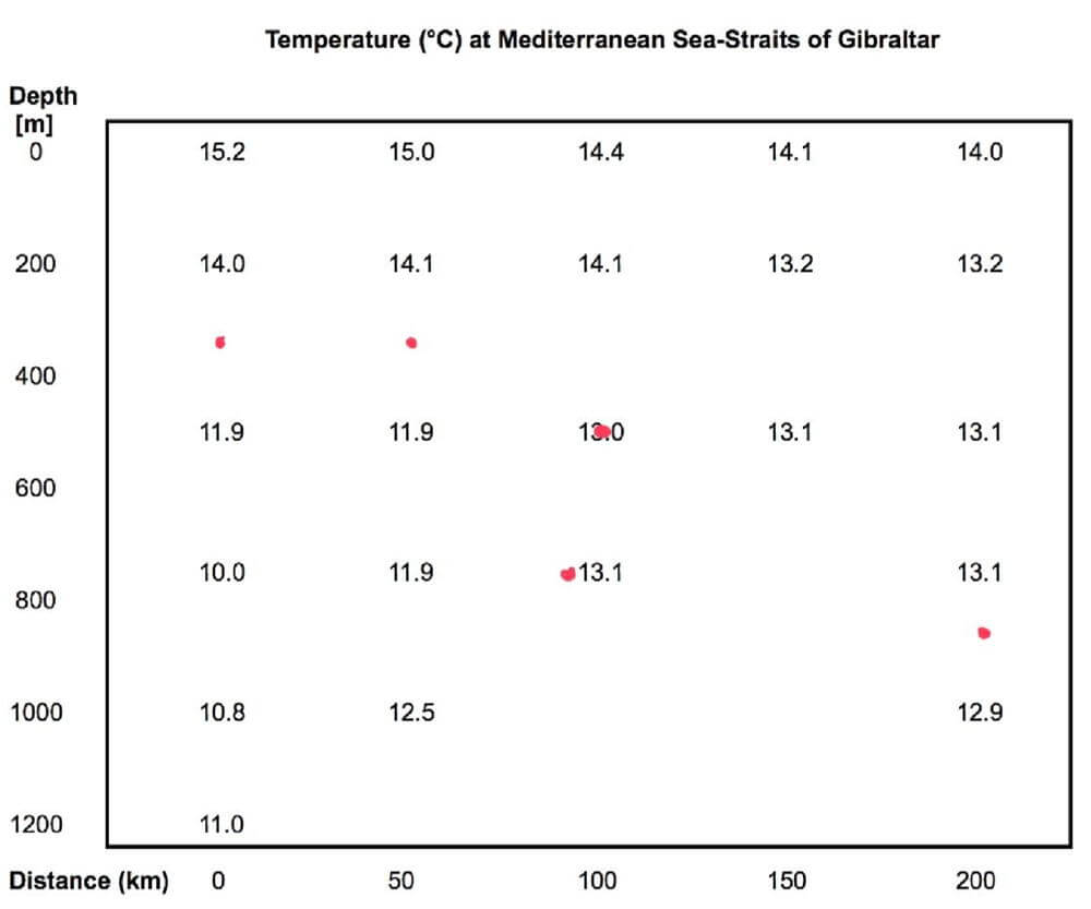
To help draw the first contour, place dots at the locations of the value to contour.
Step 3: Draw the First Contour
It is helpful to draw the first contour for a value midway between the maximum and minimum values since this divides the map into two somewhat equal regions. The first contour helps you see patterns more readily, and the remaining contours are easier to draw. In this example, draw the first contour for 13°C.
Tip: If possible, start at an edge of the map. In this case, 13 is nearly halfway between 14 and 11.9 along the left edge.
Tip: Go through and put dots where 13 falls between sets of adjacent points Connect the dots with a smooth line. Draw lightly with a pencil and have an eraser handy. Only draw where there are data – you cannot draw into a region with missing data. When done, label your contour “13”.
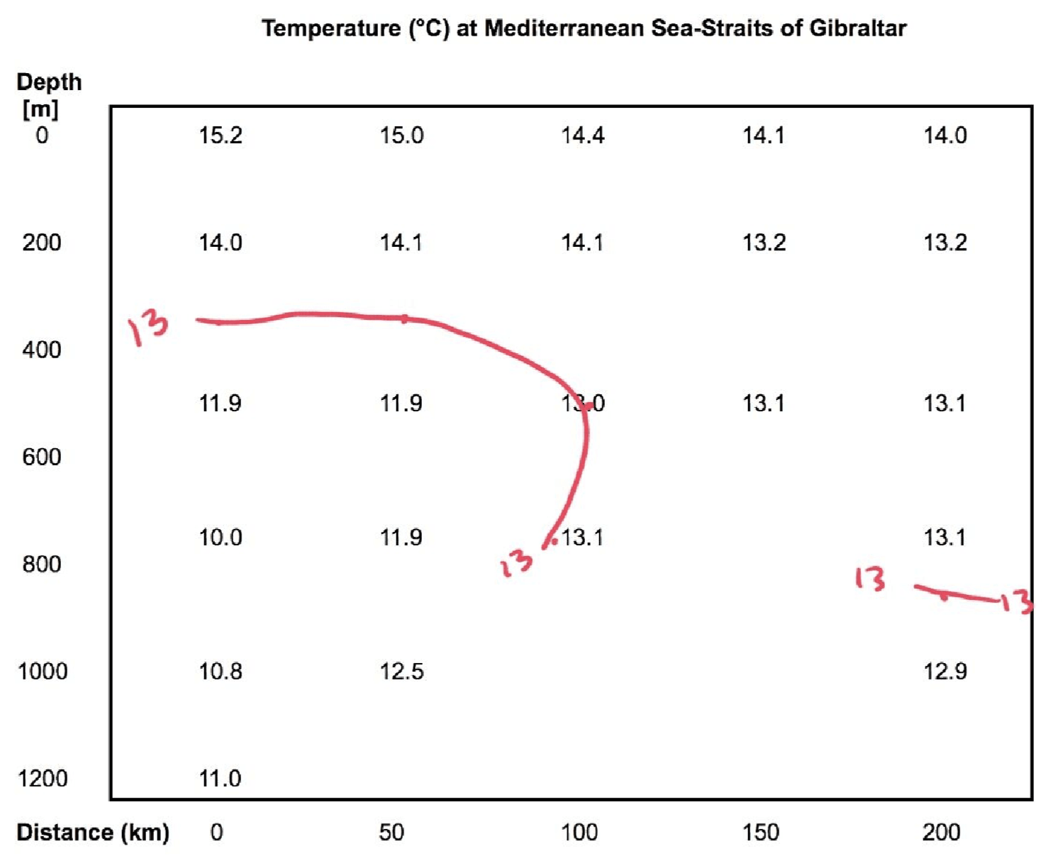
Then connect the dots with a smooth line. Don’t draw the line where data doesn’t exist!
Step 4: Draw Next Contour Adjacent to a Completed One
Draw and label the rest of the contours, starting with those adjacent in value to your first contour.
Tip: If you have a good deal of contouring to do, listen to some relaxing music.
Step 5: Look for Patterns and Relationships
Look for patterns and see if there are stories in the data.
Although the warmest water tends to be near the surface, there is very cold water with depth along Europe, and it gets cold very quickly with depth. Warm water with depth is found near Africa. This is very puzzling since warm water is less dense than cold water, so the coldest water should be found at the bottom of the entire field of data.
Rules for Contouring
- Contours cannot cross.
- Contours cannot branch or fork.
- Label all contours.
- No contours in areas with missing data.
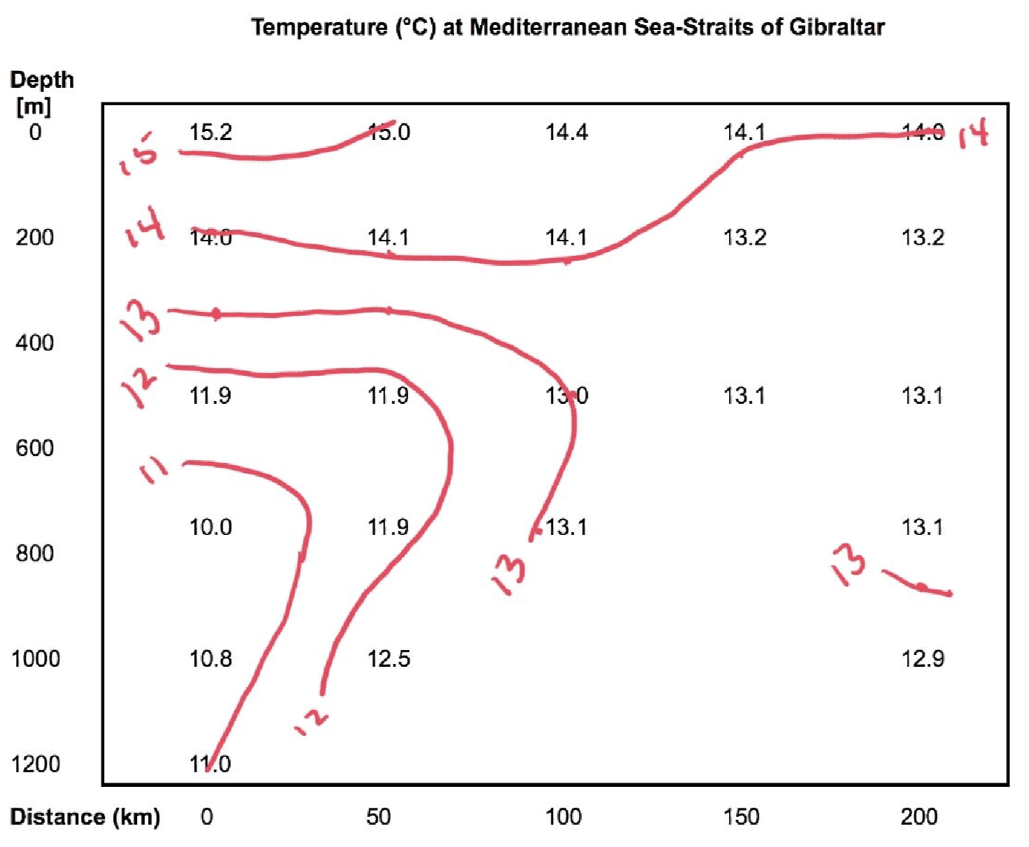
A finished contour map of water temperature of a vertical cross-section extending across the Straits of Gibraltar.
Challenge
Contour the salinity data for this same vertical cross-section (use the data link above). Salinity contours are called isohalines. Compare your answers to the solution (download below), then identify which water is entering from the Atlantic Ocean and which is exiting the Mediterranean Sea.
Hint 1: Overlay the two contoured maps to see patterns created by both sets of contours.
Hint 2: Saltier water is denser than fresher water.
Practice Data Sets for Contouring and Solutions
Contour past U.S. Surface air temperature, dew point temperature, air pressure, and relative humidity:
April 1996 fields Solutions (pdf)
Or use current weather data:
AMS Datastreme Project (see the Surface Data section for data to contour and already analyzed).
Topics in Observing
- Our Senses and Brain
- Perspective,
- Technology,
- Measurement,
- Data, Graphs, and Functions
- Function Transformations
- Contouring, and
- Improving Observational Skills.
Measure your:
0 Comments