
Color Vision
Color is a property of visible light that our eyes detect, and our brains interpret. Our eyes detect intensities of red, green, and blue light, and send this information to the vision-processing part of our brain to create images of our surroundings. To visually explore the Red/Green/Blue and Cyan/Magenta/Yellow (colors made by mixing pigments) color spaces, see Color Vectors.
If you are familiar with the apps (these are for tablet screens and larger), click on the buttons to run them. Below is supporting information on each app, buttons to run each, and apps designed for smartphone screens.
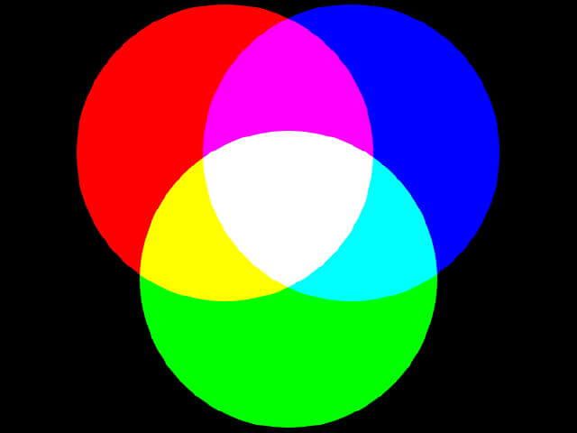
Above is an example of beams of red, green, and blue light mixing on a white wall in a dark room to create color. Our eyes, computer screens, and digital cameras work using the Red/Green/Blue color space.
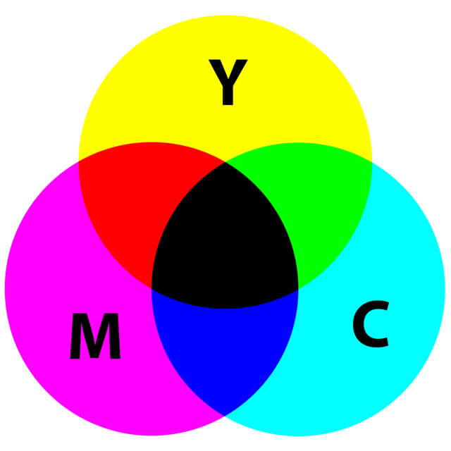
Above is an example of pigments of cyan (C), magenta (M), and yellow (Y) mixing to create color on white paper. Computer printers use Cyan/Magenta/Yellow color space.
Measure Your Sensitivity to Changes in Color
Because we have different numbers and types of cones spread out over the back of our eyes and have different vision processing capabilities in our brains, none of us see color the same way. Explore one aspect of your color vision by measuring how small a color change you can detect using the Color Change web app. A web app runs in your browser, so no need to download and install it!
There are many experiments you may try with this app:
- First, measure your sensitivity to red, green, and blue. Values closer to black or 0 show higher color sensitivity.
- Study the effect of surrounding colors in detecting a color change.
- Compare results with friends and family to explore similarities and differences.
- Do those who work in the field of visual art have a more acute color detection? What about other careers involving visual information?
- Does your sensitivity change with your mood? How tired are you? After exercise?
The desktop to tablet version app allows you to save the results to a file to analyze in spreadsheet programs. Data include the date and time when created.

Above is the opening screen of the Color Change web app.
Acknowledgments
I want to thank Lincoln Berkley, Mason Glidden, John Hodges, Mattea Horne, and Cydnie Reiman for their invaluable suggestions during beta testing.
Click the button to run the Color Change web app designed for tablet screens and larger.
Click the button to run the Color Change web app designed for smartphone screens.
These apps measure sensitivity to color change, so use them creatively for research.
How to Use the Color Change Web App
To begin a color challenge, click the ‘Begin’ button, which starts the black image to change color at the selected time interval continuously. The intensity of color, red, green, or blue, increases at a constant 1/255 unit of color intensity. When you know which color is changing, click that color’s button. If correct, the color intensity is recorded. If incorrect, the challenge is reset.
To measure your sensitivity to color change, you must identify the colors of 10 randomly generated cases, and the average intensity to identify red, green, and blue are calculated. Colors intensities are based on those used to display color on the computer screen: 0 to 255 where zero has no intensity and 255 is the maximum displayed. To make the math easier, your results are shown from 0 to 100%.
Finally, compare your results to others who have completed their 10 colors.
Our World of Color
Because I grew up the son of an artist, I learned how color creates beauty and evokes emotion. But as a scientist, I used color to share information. One of the first educational software programs I wrote explored the worlds of color created by light and pigments to help people learn about data in digital images. My mother, the artist, was one of my beta testers. Since the software was to be used in schools, rather than explore all 16 million colors, there were only one million. After each click creating a color one-millionth different than the previous one, she stopped and gushed over the new color. Since then I have wondered if our interests are influenced by enhanced capabilities in one or several of our senses.
Many years ago visiting environmental journalists attended a workshop at the museum where I worked. Since satellite imagery provided new ways to study Earth’s environment, we included activities that explored the color in digital images. Journalists learned the basics of color and then had to identify the intensities of red, green, and blue in the color the computer randomly displayed. One journalist proudly proclaimed he correctly identified the components each time despite being color blind. This piqued my interest in exploring what each of us perceives when looking at the same object. These questions and interests shaped the activities on this webpage.

Dogs detect a different range of colors than humans, which made me wonder how my dog picked his spots to take in the view.
8 colors
125 colors
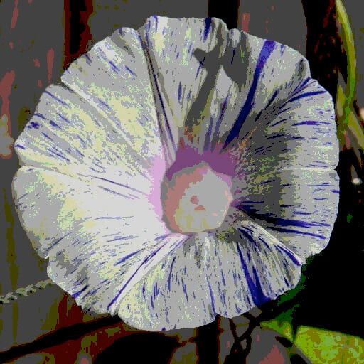
729 colors
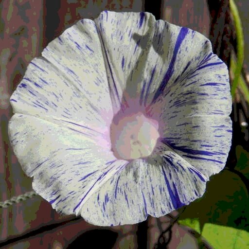
5000 colors
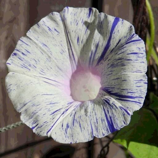
36,000 colors
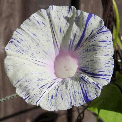
275,000 colors
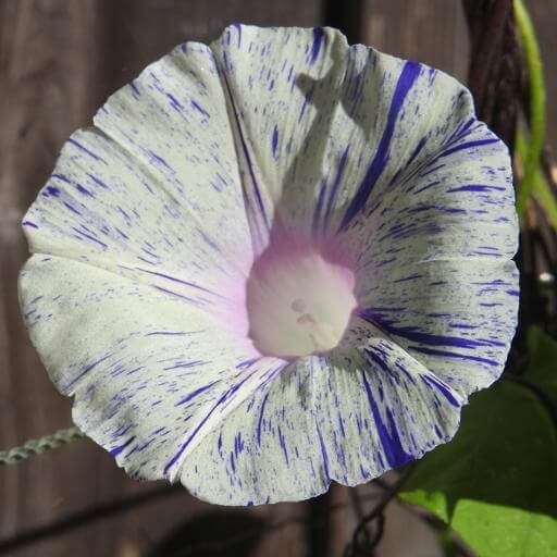
16 million colors
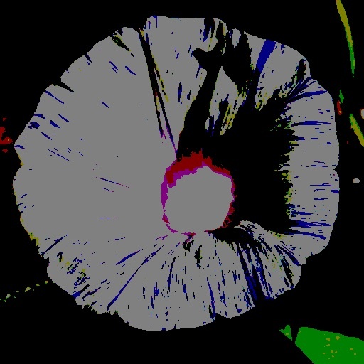
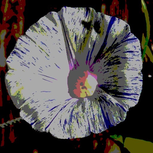
Color Resolution
The same image of a morning glory but with different color resolutions. Imagine a world where we could only detect 8 colors! Humans see between 7 to 10 million colors, and some up to 100 million!
Why do we see so many colors? Survival. Color helps us find and gather food.
Organisms that detect light have different sensitivities across the light spectrum. Most mammals have only two color receptors, yet humans have three. View examples of what a number of animals see, and even some examples of what color-blind humans see.
To think about what the world would look like with one of the most primitive color visions to just beyond what humans can see, explore images with fewer colors using the Color Resolution web app.
Click the button to run the web app.
View a number of images with different color resolutions. Click on the left half of the image to increase resolution, the right half to decrease it.
Sensitivity to Differences Between Colors
There are three primary colors in mixing beams of light: intensities of red, green, and blue may be mixed together to create all of the visible colors we see. In pigments, the primary colors are yellow, magenta, and cyan. The activity above explored detecting color change going from black to a primary color or from white to a primary color.
Most humans detect between 7 and 10 million different colors (and some can see up to 100 million colors!), but the computer screen displays over 16 million colors. Which ones can you not see? Are these undetectable colors distributed evenly across the visible color spectrum? Use the following web app to see what colors you are missing.
As with the first color testing app, there are many experiments possible. Save your results to a text file that may be used in a spreadsheet program for analysis. The date and time of each file are included.
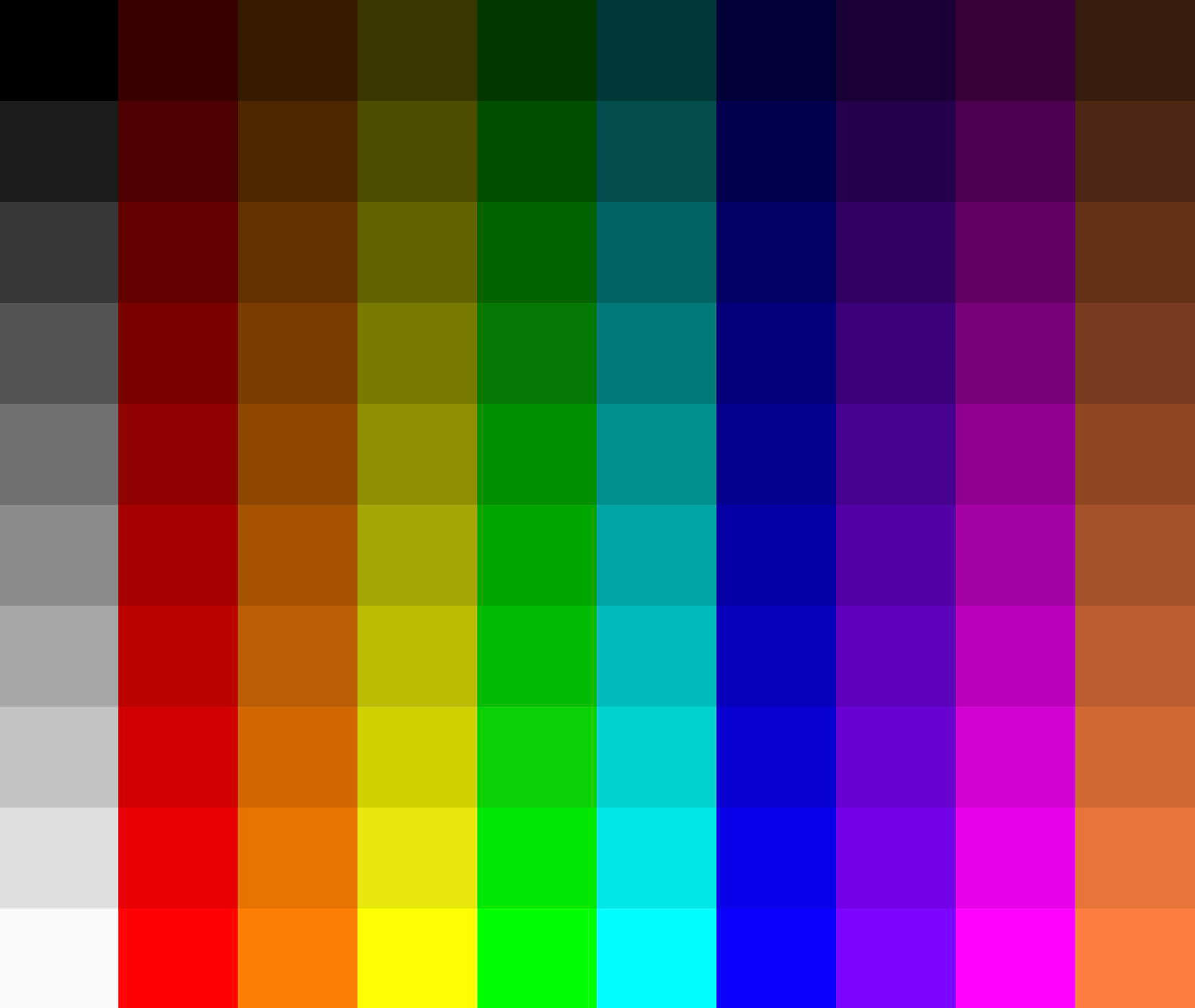
Test the color resolution of your computer screen. You should see 100 distinct color tiles in the image above. If not, then your display has a limited range of colors that will affect the web app’s results.
The Color Difference Web App
How different do two colors need to be so you see both? Use the Color Difference app to find out!
Click the button to run the Color Difference web app that is designed for tablet screens and larger.
Click the button to run the Color Difference web app designed for smartphone screens.
Acknowledgments
I want to thank Lincoln Berkley, Mason Glidden, Mattea Horne, and Cydnie Reiman for their important suggestions during beta testing.

There is a circle in the image above. Can you see it? Its color is 10 units of blue greater than the surrounding color. Use the web app to test if you can see even smaller differences between colors.
Using the Color Difference Web App
The goal is to identify the object’s shape that appears as its color changes in as few increments as possible. Measure your sensitivity to differences in a range of colors by completing 15 randomly generated challenges and compare your results to those who have used the app before you.
There are five categories of color tests based on the relative intensity of the color component (red, green, or blue) is within the color:
-
- The color component is the dominant and only intensity, so the starting color displayed is either a moderate shade of red, green, or blue.
- The color component is one of two dominant intensities (co-dominant in the app), so the starting color displayed is either a moderate shade of yellow, magenta, or cyan.
- The color component is an intermediate intensity compared to the other two. For example, orange has more red than green than blue, so green is the intermediate color component.
- The color component is a minor intensity within the color.
- All three components are comparable, so the starting color is gray or a neutral color.
How does your ability to detect color differences depend on the relative intensity of the component within the displayed color?
Tips for Color Experiments
Since you may save the results of the Color Change and Color Difference web apps, consider designing experiments to explore people’s color vision (male vs. female, age, profession, left eye vs. right eye, etc.). Below are some tips to minimize the variability of tools being used to display the apps.
-
- Use the same computer screen each time.
- Make sure the screen brightness is always the same.
- View the screen from the same angle.
- Minimize glare from the screen.
- Clean dust and smudges from your screen.
Topics in Observing
- Our Senses and Brain
- Perspective,
- Technology,
- Measurement,
- Data, Graphs, and Functions
- Function Transformations
- Contouring, and
- Improving Observational Skills.
Measure your:
0 Comments