Data, Graphs, and Functions
Many activities and processes used in today’s careers and lifestyles rely on data to analyze situations, make predictions, and take action. Stacks of data alone would be too overwhelming to process efficiently and effectively. So graphs and functions help visualize and analyze patterns, trends, and relationships within and between sets of data. As with many technologies, there is no one perfect form that meets every need of the user, so we need to be adept at going between the forms of data, graphs, and functions to recognize and use the full breadth of information within a collection of measurements.
Data
Since data are so useful, humans have been collecting data for at least 20,000 years. Data capture information or knowledge in a form that provides efficient processing and application. The data we will focus on in this website are measured relative to a scale with exact differences between the values and may or may not have a “true zero.” For example, the Fahrenheit temperature scale has a zero value, but there are values below this, so 0ºF isn’t an absolute zero temperature value based on the Fahrenheit scale. Air pressure does have a true zero value: there is nothing with less air pressure than 0 lbs/in². The color intensities shown in the following screenshot from the game, Suzie the Artist, have a true zero value.
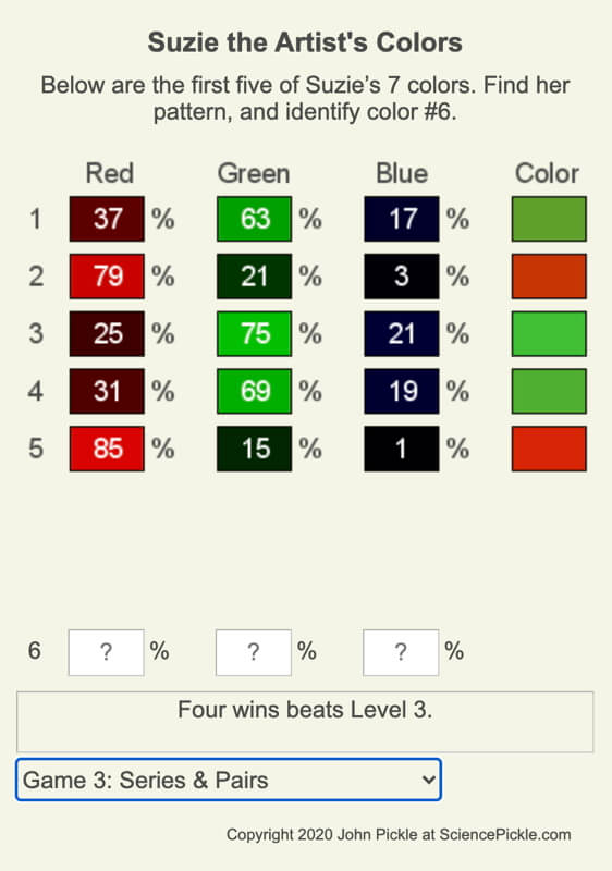
| Red | Green | Blue |
| 25 | 75 | 21 |
| 31 | 69 | 19 |
| 37 | 63 | 17 |
| 79 | 21 | 3 |
| 85 | 15 | 1 |
Here are two examples of the color intensities with a pattern that Suzie the Arist decided to create. The first (and colorful!) set of data are shown in the order she picked the colors, and the second has been ordered based on increasing values of red. Is there a difference in how you see patterns and relationships within the data?
Want to play your own game?
The web app is free and available here.
How We View Data
Sometimes, we are able to collect data through controlled experiments, where one variable changes in an ordered fashion, which helps us see trends in and relationships between other variables, and sometimes, we need to collect data about an ever-changing system, such as the atmosphere, oceans, ecosystems, financial and business systems, etc. Viewing tabular sets of data from one perspective limits how well you can spot important patterns and details.
Graphs
Graphs are visual displays showing the relation between variable quantities and were created well after humans began collecting data. There are many types of graphs, such as pie charts, bar graphs, scatter plots, etc. We will focus on scatter plots, which are typically two variables measured along one of a pair of axes at right angles.
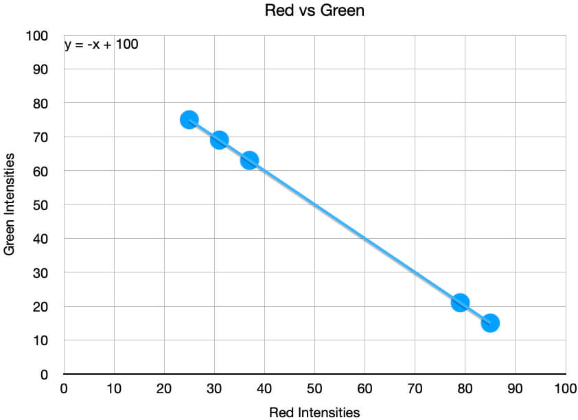
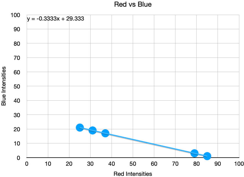
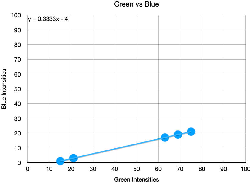
Below are three scatter plots of the color intensity data shown above. Notice that the order the data were picked cannot be discerned, so if this were important, you would need to change your graph, add additional information to your graph, or change how you viewed the data.
What the graphs quickly show are that the color intensities are linearly related to each other. These relationships will help us identify what Suzie’s remaining two colors she will use that day.
Viewing Data in Graphs
- “Tour” the graph:
- What data are measured in each of the axes?
- What are their units?
- Are the scales of each linear, logarithmic, or something else?
- What are the minimum and maximum values of each set of data?
- Are the data evenly spaced from each other? In clumps?
- Look for relationships between the variables.
- No relationship is just as important to recognize as is if there is a linear, quadratic, logarithmic, etc. relationship.
- Quality of the fit of the relationship? Are there outliers? If so, is there a cause?
Functions
Functions are maps of how input values are converted to output values where each input has only one output. Typically functions are written symbolically. One common form is f(x) = x² where f is the symbol representing the function, x is the input to the function, and x² is the output. Another form of this function is y = x² where y = output, x = input, and there isn’t a symbol of the function.
Each of the three graphs above contains an equation showing how one color intensity is mapped to another. Using the Red vs Green graph, y = –x + 100 where x = the red intensity and y = the green intensity. By substituting these into the equation, we get:
Green = -Red + 100 = 100 – Red
There are two remaining equations, but since all three colors are related to each other, we only need to use one more. The most straightforward is y = 0.3333x – 4 = x/3 – 4 where x = the green intensity and y = the blue intensity, or:
Blue = Green / 3 – 4
Now, if we have a starting color intensity, we can calculate the other color intensities. What if Green = 25?
Blue = Green / 3 – 4 = 25 / 3 – 4 = 4.3333
Does this fit the pattern observed in the data? No. Looking more closely at the data, we see that all of the color intensities are integers. So pick a green intensity that is divisible by 3, say 24.
Blue = 24 / 3 – 4 = 4
Does this fit the pattern observed in the data? No, since all of the intensities are odd integers. So pick a green intensity divisible by three, which yields an odd integer, say 27.
Blue = 27 / 3 – 4 = 5
And this fits the patterns in the data, so complete our calculation of the red intensity:
Red = 100 – Green = 100 – 27 = 73
Typing this into the game, we see this is correct. After identifying a second correct color, notice that the equations the game used are not identical to what we calculated, but you can rewrite the ones we found to be the ones used in the game.
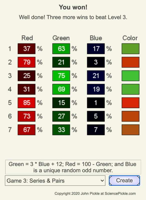
Notice that there are many solutions to this puzzle since the only requirements are that the blue intensity is odd and hasn’t been used yet. Too often, we are taught puzzles, games, and science experiments in class have one solution, yet life and nature often don’t have one outcome, due, in part, to the randomness of one or more variables in the system. Suzie the Artist is an attempt to help people learn to identify. consider, and deal with randomness in a scenario.
Combining the Strengths of Data, Graphs, and Functions
To complete the challenge illustrated above, you needed to study:
- the data to recognize that all of the color intensities were odd integers,
- the graphs to see that the color intensities were linearly related to each other, and
- the functions that quantified the relationships between the intensities to select two from the possible remaining colors that fit Suzie’s rules.
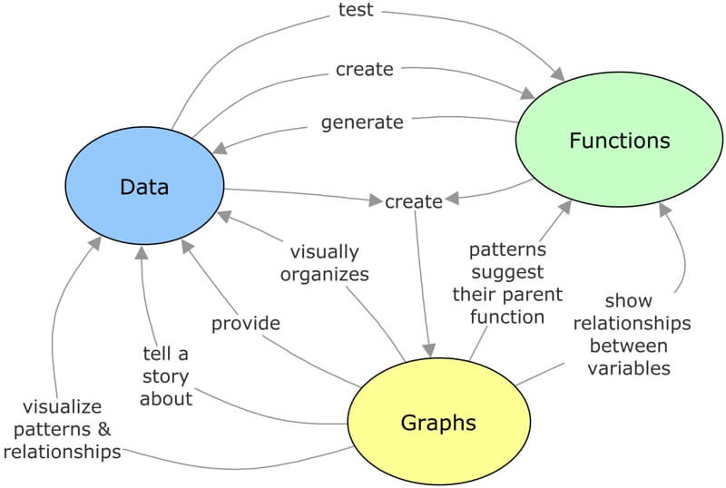
The following concept map is an attempt to show the connections between data, graphs, and functions. To maximize the strength of each, you need to be able to create each form from another.
Topics in Observing
- Our Senses and Brain
- Perspective,
- Technology,
- Measurement,
- Data, Graphs, and Functions
- Function Transformations
- Contouring, and
- Improving Observational Skills.
Measure your:

0 Comments